Color Blending: Elevating Artistry
- Techniques
- 3 min reads
Coloring books have evolved from simple childhood pastimes to intricate canvases for adult creativity, demanding professional-level techniques to bring designs to life. Among these, color blending stands out as a skill that transforms flat outlines into vibrant, dimensional artwork. For artists aiming to master professional color blending in coloring books, success lies in combining advanced tools, strategic techniques, and a deep understanding of color dynamics. Here’s how to achieve stunning results tailored to this unique medium.
Mastering Color Theory for Coloring Books
Professional color blending begins with a solid grasp of color theory, adapted to the constraints and opportunities of coloring books. The color wheel—primary, secondary, and tertiary hues—guides choices, but professionals also consider value (lightness/darkness) and saturation. Coloring book pages often feature detailed patterns or scenes, so blending analogous colors (e.g., blue to green) creates smooth, cohesive transitions, while complementary pairs (e.g., purple and yellow) add bold contrast. Temperature matters too—warm reds blended into cool blues can evoke depth in florals or landscapes. Professionals select palettes that enhance the design’s theme, like earthy tones for nature scenes or pastels for whimsical illustrations, ensuring harmony across the page.
Selecting Professional Tools
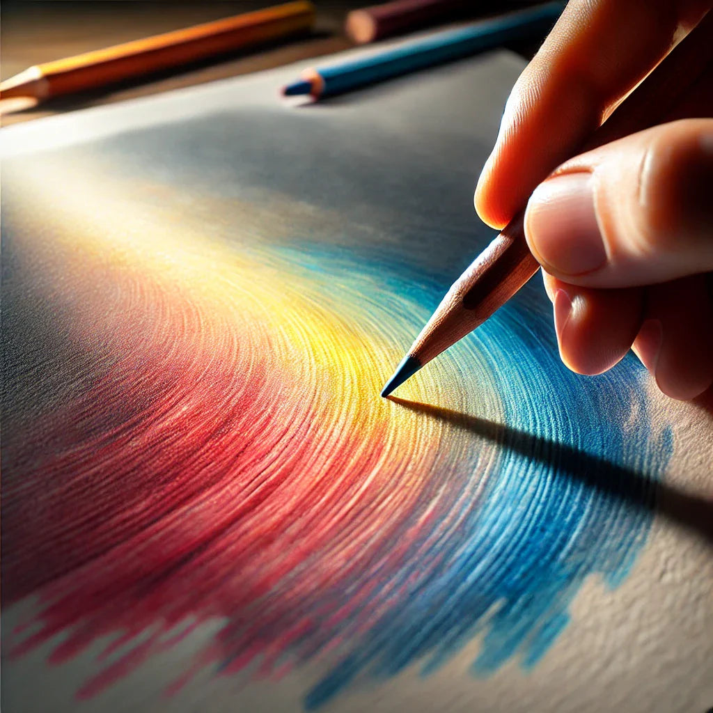
The medium of choice for coloring books is typically colored pencils, markers, or gel pens, each requiring specific blending tools. High-quality colored pencils, like Prismacolor or Faber-Castell Polychromos, offer rich pigments and blendability. Professionals pair these with blending stumps, tortillons, or colorless blender pencils to smooth transitions. For markers (e.g., Copic or Tombow), a colorless blender marker or overlapping shades achieves gradients. Paper quality matters—coloring books with thicker, slightly textured pages handle layering and blending better than thin, slick ones. Some artists even use solvents like mineral spirits with pencils for an ultra-smooth, painterly effect, though this requires caution to avoid bleeding through.
Layering for Depth
Unlike canvas painting, coloring books limit blending to the page’s surface, so professionals rely on layering. Start with a light base color, applying it evenly across the area to be blended—say, a pale yellow for a flower petal. Gradually layer a second color, like orange, starting where the deepest hue is desired and fading toward the base. Use light, circular strokes to build intensity, preserving the paper’s tooth (texture) for subsequent layers. This technique adds dimension, making elements pop against intricate backgrounds, a hallmark of professional work.
Blending Techniques Tailored to Coloring Books
Precision is key in tight spaces. For pencils, professionals use a “burnishing” technique—pressing harder with a lighter color over a darker one—to meld hues seamlessly. Feathering—short, overlapping strokes—softens edges in small areas like leaves or mandalas. With markers, they blend wet-on-wet by applying a lighter shade over a still-damp darker one, working quickly before it dries. For tricky spots, a white pencil or gel pen can overlay and soften transitions. Professionals avoid over-blending, which can muddy colors or wear the paper, instead maintaining deliberate contrasts to honor the design’s lines.
Finishing Touches and Practice
Once blended, step back to assess balance. Add highlights with white or metallic pens, or deepen shadows with a darker shade. Test blends on scrap paper first, especially with new tools or palettes. Mastery comes from practice—experiment with pages of varying complexity to refine your intuition. In coloring books, professional color blending turns outlines into art, blending skill with imagination.
123